When you need a dashboard to show, not query
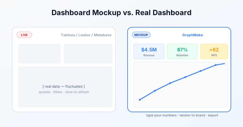
There are two kinds of dashboards. The first is a live BI tool — Tableau, Looker, Metabase, Power BI — connected to a real data source, with filters and queries, used to answer questions on demand. The second is a dashboard mockup: a static picture of what a dashboard could look like, used to communicate a concept.
Most people googling "dashboard tool" want the first kind. But there is a sizable second audience — product designers, founders, marketing teams, instructors — who only need the second. They are pitching an idea to a stakeholder, designing a feature before engineering builds it, screenshotting an analytics view for a marketing page, or training new hires on what a dashboard should reveal.
For that audience, mocking a dashboard in Tableau or Looker is overkill. Doing it in Figma works but you have to design every chart by hand. A purpose-built mockup tool with real chart widgets and stat cards is faster.
What a good dashboard mockup tool gives you
A short list:
Real chart widgets, not placeholder rectangles. Line charts, bar charts, donut charts that you can populate with the numbers you want shown — without writing SQL or connecting a data source. So the mockup actually looks like a dashboard, not a wireframe.
Stat cards and KPI rings. The big-number-on-a-card pattern that dominates real dashboards. Fast to drop in, easy to recolor to brand.
Pre-built layouts. A blank canvas is a blank canvas. Templates that already have the spacing and grid worked out save 80% of the time.
One-click export. PNG for screenshots, SVG for design handoff, PDF for sharing or print.
When to mock vs. when to use the real thing
Use a mockup when:
You are pitching a product or feature idea and need to show what the dashboard will look like.
You are designing a redesign and want to show stakeholders before engineering invests in building it.
You are screenshotting "your product" for a marketing page or social post but cannot expose real customer data.
You are writing a tutorial or case study and need a clean example dashboard with chosen numbers.
You are training people on what to look for in a real dashboard — without giving them access to production data.
Use a real BI tool when you actually need to query data. Mockups are presentation graphics, not analysis.
How to make a dashboard mockup in GraphMake
Open the dashboard mockup maker page and either start from a template (KPI Dashboard, Performance Dashboard, Growth Metrics Dashboard) or start from a blank canvas in editor.
For each widget you want, drag from the left panel: Stat Card for big numbers, KPI Ring or Gauge for percentage metrics, Bar Chart or Line Chart for trends, Comparison Bar for before-and-after, Progress Bar for goals. Type your data into each widget — it renders instantly.
Recolor each widget to your brand palette via the right panel. Drag widgets around to compose the layout you want. Export as PNG (1x, 2x, or 3x), SVG, or PDF.
For text-based generation (e.g. asking an LLM to lay out a dashboard for you), paste a script into the editor's Script tab. See /script for the syntax.
Ready to build?
Open the free editor and start creating — no signup needed.
Mockup vs. screenshot of a real dashboard
A common alternative is to take a screenshot of your real Tableau or Looker dashboard, crop out the sensitive bits, and use it as a marketing image. Three reasons mockups usually win:
Screenshots leak data. Cropping helps but never fully covers the row count, axis ranges, and other identifying signals.
Screenshots are locked to whatever the underlying tool produces — same fonts, same colors, same chart styles. A mockup can match your marketing brand exactly.
Screenshots date instantly. Today's "85% retention" is tomorrow's "73%". A mockup lets you pin the numbers you want forever.
For pitch decks, design specs, marketing pages, and training material, mockups are almost always the cleaner artifact.
When NOT to use a dashboard mockup tool
If you actually need to look at live data, query it, filter it, or share an interactive view, do not use a mockup tool. You need a real BI tool. Tableau, Looker, Metabase, Power BI, Mode, and Grafana all do that job better than any infographic generator could.
And if your team needs many people viewing/editing the same dashboard concurrently, the right tool is probably Figma — designed for multi-user design collaboration.
Try it
The dashboard mockup maker page has the generator, four templates, and a one-click "open in editor" path. No signup, no watermark.