Dashboard Mockup Maker
Infographics & ContentCreate visual dashboard mockups for reports, pitches, and screenshots. Drag stat cards, KPI rings, and charts onto one canvas. Not a live BI tool — for presentation graphics. Free, no signup.
Free PNGNo signupNo watermark
Loading tool...
Was this tool helpful?
Watch the Tutorial
Fill KPI tiles with your own figures, labels and deltas, colour each metric, feed the chart panel real points, then size the board for a slide, a report or a wide screen.
How to Use
- 1
Start from an example
Pick Executive KPI, SaaS Growth or Product Health.
- 2
Choose a layout
Executive report, SaaS growth or Product health.
- 3
Put in your numbers
Click any number or label on the dashboard and type. Edit chart values in the Data panel, and use Add data point for more.
- 4
Pick a theme and size
Studio, Midnight or Fresh in the Style panel, and the canvas in the Size panel.
- 5
Download
Download PNG is free with no watermark. Pro adds SVG and HD PNG at 2×, 3× and 4×.
Why Choose GraphMake?
When to use a dashboard mockup tool
A dashboard mockup is a static visual of what a dashboard could look like — not a live data view. Mockups are the right tool when you need to communicate a dashboard concept rather than query data: pitching a product idea to stakeholders, screenshotting an analytics view for a marketing site, mocking up a redesign before engineering builds it, illustrating a report or case study, or training people on what to look for in a real dashboard.
GraphMake gives you the same outcome as designing the mockup in Figma or Sketch but with built-in chart widgets, stat cards, KPI rings, and progress bars — so the visuals look like data instead of empty placeholders. You drag widgets onto a canvas, type in the numbers you want shown, recolor to brand, and export.
Why this beats screenshotting a real dashboard
Screenshots of live dashboards leak data, lock you to whatever the underlying tool produces, and date instantly. A mockup lets you show exactly the numbers, layout, and visual style you want — without exposing real customer or business data, without depending on a paid BI seat to render it, and without re-cropping every time the data refreshes.
For pitch decks, design specs, marketing pages, and training materials, a mockup is almost always the better artifact.
Start from a Template
Jump-start your design with a ready-made layout — just replace the data.
KPI Dashboard
Executive KPI dashboard with stat cards, line chart, gauge metrics, comparison bars, progress bars, and a summary callout.
Use this templatePerformance Dashboard
Track KPIs at a glance with gauge charts, a data table for quarterly breakdown, and scatter chart for investment vs. return analysis.
Use this templateGrowth Metrics Dashboard
A dark-mode business dashboard showcasing KPIs, revenue growth, customer acquisition, and conversion funnels for SaaS and startup reporting.
Use this templateFrequently Asked Questions
Is this a live dashboard tool like Tableau or Looker?
No. GraphMake creates static dashboard mockups — visual graphics for presentations, pitch decks, marketing screenshots, design specs, and reports. There is no data connection or query layer. For live data dashboards, use Tableau, Looker, Metabase, or similar BI tools.
When should I use a dashboard mockup vs a real dashboard?
Mockups are for showing what a dashboard could look like (pitches to stakeholders, design specs for engineers, marketing screenshots, before-and-after comparisons, training material). Real dashboards are for analyzing live data. Many product designers use mockups in Figma; GraphMake gives the same outcome with built-in charts and stat cards instead of having to design each widget by hand.
Can I export the dashboard mockup?
Yes — download a free PNG with no watermark. The export matches the on-screen canvas exactly.
Are there pre-built dashboard templates?
Yes — start from Executive KPI, SaaS Growth or Product Health, and switch between the Executive report, SaaS growth and Product health layouts. Then put in your own numbers.
Can I mix charts and stat cards in one dashboard?
Yes — every layout already combines KPI cards and charts. Click any number or label to change it, and edit chart values in the Data panel. For a free-form layout, the /editor has 60+ widget types you can place anywhere.
Can AI generate a dashboard mockup for me?
Yes: in the /editor, click AI Generate, describe your dashboard or paste the numbers, and the layout lands on your canvas, ready to edit. A free account includes 3 AI generations, and Pro includes more. Without an account, copy a prompt from the AI Prompts tab into ChatGPT or Claude, then paste the GraphMake Script it writes into Import. See /script for the syntax.
Related Tools
Free Stat Card Maker
Create eye-catching statistic cards for infographics, dashboards, and presentations. Highlight key numbers with bold typography and icons. Free, no signup.
Try it freeFree Chart Maker Online
Create bar, pie, line, donut, and other charts online for free. Data visualization without code — paste your data, customize colors and labels, then export a clean PNG instantly. No signup, no watermark.
Try it freeFree Comparison Infographic Maker
Create side-by-side comparison infographics for free. Compare products, services, ideas, or data with beautiful visual layouts. Export as PNG.
Try it freeLearn More

Dashboard Design Tips: Build Infographic Dashboards
Most dashboards are cluttered, confusing, and ignored. Here's how to design dashboard-style infographics with clear hierarchy, smart chart pairing, and zero fluff.
Read more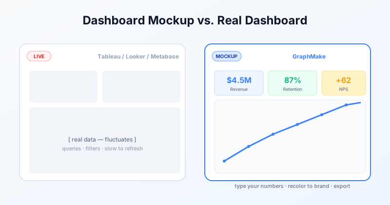
Free Dashboard Mockup Tool: a Dashboard to Show, Not Query
Make a visual dashboard mockup for pitches, design specs, or marketing screenshots. Free, no signup. Different from Tableau or Looker — built for static presentation graphics.
Read more