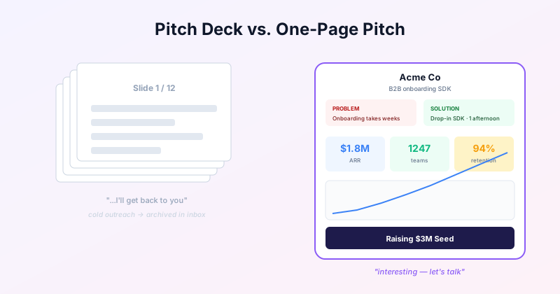
A 12-slide deck is the wrong format for cold outreach
There is a place for full pitch decks — live presentations, formal investor meetings, due diligence. That place is not your inbox. It is not your LinkedIn DMs. It is not a Twitter post.
For cold outreach, the format that lands is a single image: the whole story visible at a glance. The reader scans it in 5 seconds, decides whether to engage, and replies — or saves it for later. They do not click through 12 slides.
The 12-slide deck still exists. It comes after — the meeting the one-pager earned.
The standard one-page pitch layout
After looking at hundreds, the structure that consistently works has six elements:
Header: company name, one-sentence tagline. The tagline does the work of the first 3 slides of a deck.
Problem / Solution: two callout boxes side-by-side. 1-2 lines each. Concrete, not abstract. "Engineers spend 30% of sprint time on onboarding" beats "onboarding is hard".
Traction stats: 3-4 stat cards in a row. ARR, customers, growth rate, retention, market size — pick the 4 that tell the strongest story. Each with a delta or context line ("$1.8M ARR, +18% MoM").
Growth chart: a single line or bar chart showing the curve. If the curve is great, this is your loudest signal. If the curve is mixed, pick a metric where the curve is great.
Team / Customers: small icon grid or logo row. Establishes credibility without taking much space.
Ask / Where you are going: dark contrast box at the bottom. "Raising $3M Seed to reach $10M ARR in 18 months." Specific.
When to use a one-page pitch
One-pagers shine in:
Cold LinkedIn or email outreach. Image attached, body text 2 sentences. Way higher reply rate than a deck link.
Twitter / X posts about your raise or launch. A single shareable image gets engagement; a slide carousel rarely does.
Leave-behinds after a meeting. Recipient scans on the train, forwards to a partner. A deck gets archived.
Embeds on your About / Investors page. Visitors who would never click through a slide deck will glance at a one-pager.
Job applicants or candidates. Recruiters often want the 30-second pitch on the company. One-pager fits the brief.
When to use a full deck instead
A one-pager is wrong for:
Live presentations where you talk to slides for 20+ minutes. You need slides for pacing and for the audience to follow.
Formal pitch meetings with investors who expect a deck and want a slide-by-slide walkthrough.
Due diligence rooms — you need depth across each topic, which a one-pager cannot deliver.
Complex products where the one-pager raises more questions than it answers.
A working pattern: build both. Use the one-pager for outreach. Bring the full deck to the meeting it earns.
Ready to build?
Open the free editor and start creating — no signup needed.
How to make a one-page pitch in GraphMake
Open pitch infographic maker and click "Open editor". Drop widgets in order:
Heading + subtitle at the top (company name + tagline).
Two Callout widgets side-by-side for Problem / Solution. Color them differently — red-ish for problem, green-ish for solution.
A row of 3-4 Stat Cards for traction. Each has a big number, a label, and optionally a small delta line.
A Line Chart or Bar Chart underneath showing the metric with the best story.
Below that, optionally Icon-Text Row for team or a Logo Grid for customers.
A final dark Callout at the bottom: "Raising $X. Reaching $Y by [date]." Specific.
Export as PNG 2x for LinkedIn / Twitter, or PDF for email. Free, no watermark.
Try it
The pitch infographic maker page has the layout walkthrough and links to the editor.