Why most SOPs go unread
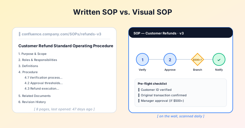
A standard operating procedure document is the right artifact for the compliance archive. It is the wrong artifact for the operations floor. People do not read 8-page Word docs while they are mid-task. They glance, then proceed from memory — and memory drifts.
The fix is not "write a shorter SOP". It is "produce a different artifact for the people doing the work". The compliance team still gets their full written SOP in Confluence. The floor staff get a one-page visual on the wall.
A visual SOP is not a replacement for the written one. It is a delivery channel for the same content, tuned to scanning rather than reading.
When a visual SOP works
Visual SOPs land best when:
The audience scans, does not read. Operations floor, frontline support, kitchen staff, lab benches, customer-facing process explainers.
The process is mostly linear. A visual SOP can handle 1-2 decision branches, but if every step depends on conditional logic, a written SOP or a flowchart is the better artifact.
The process has roles or handoffs. A visual makes it obvious who does what — color-coding, icons, lane separation.
You want compliance via clarity, not via signature. A visible wall SOP is harder to plead "I did not know" than a Confluence page nobody opens.
Anatomy of a one-page visual SOP
The format that consistently works has six elements:
Title banner at the top: SOP name, version number, last-updated date. Makes the doc auditable at a glance.
Process steps, numbered, left-to-right or top-to-bottom. Each step is one verb + a short object. Not a paragraph.
Role icons under each step: who is responsible. Often a single avatar or function label (Support, Manager, Finance).
One decision diamond if a branch is unavoidable. Two — maximum. More than two and the SOP is too complex for a one-pager.
Pre-flight checklist in a box at the bottom: prerequisites, sign-offs, things that must be true before the process starts.
Footer with the owner and the link to the full written SOP. Visual artifact + escape hatch to the canonical doc.
When a visual SOP does NOT work
Skip the visual format when:
The process has more than 3 decision points or significant branching.
You need version history at the paragraph level for compliance audits.
The audience is technical and prefers structured text (e.g. an engineering runbook may work better in Markdown).
The process is screen-based and screen-recorded captures (Tango, Scribe) communicate it better than a static visual.
Ready to build?
Open the free editor and start creating — no signup needed.
How to make a visual SOP in GraphMake
Open visual sop maker and start from editor. Drop these widgets in order:
Heading widget at the top for the SOP title. A subheading with version and date.
Process Steps widget for the linear flow. Number each step. Add an icon per step (file, phone, check, etc.) to make role-at-a-glance obvious.
A Flowchart widget if you need 1-2 decision branches. Use diamond shapes for decisions, rectangles for actions.
A Checklist widget at the bottom for prerequisites and sign-offs.
Export as PDF for printing on letter or A3, or PNG for posting on team Slack channels and operations dashboards.
Try it
The visual sop maker page links to the editor and lists the widgets to use. No signup, no watermark — free PDF export.