What Is an Org Chart and Why Does It Matter?
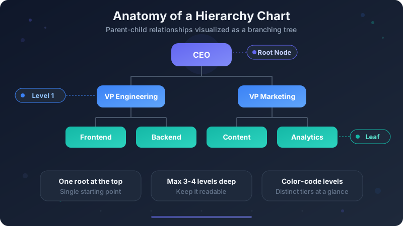
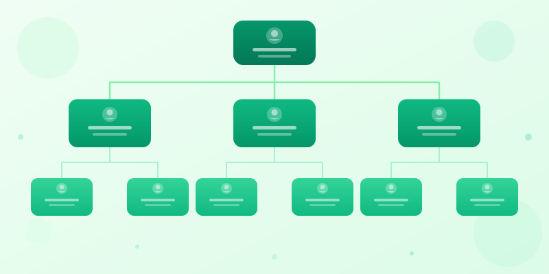
An organizational chart — org chart for short — is a diagram that shows the structure of an organization. It maps out who reports to whom, how departments connect, and where each role sits in the hierarchy. Think of it as a visual directory that answers "who does what and who's in charge?"
Org charts matter because structure is invisible until you draw it. New hires need to understand reporting lines. Executives need to spot gaps or redundancies. Project managers need to know who has authority to approve decisions. An org chart makes all of that instantly clear.
They're not just for large corporations. Startups use org charts to plan future growth. Nonprofits use them for board structures. Even small teams benefit from mapping out responsibilities, especially when roles overlap or change frequently.
Best Way to Create an Org Chart
The best way to create an org chart is to start with reporting relationships, not design. List each person or role, add the manager they report to, group related roles by department, then choose a layout that makes the chain of responsibility obvious.
For professional org charts, keep each box consistent: name, title, and department are usually enough. Use color for departments, solid lines for direct reporting, and dotted lines only when a role has secondary or matrix reporting. That structure is what makes an organizational chart easy to trust.
If you call it an organogram, organization chart, or hierarchy chart, the workflow is the same: gather roles, define parent-child relationships, draw the structure, simplify labels, and export the chart for onboarding, planning, or documentation. Start with org chart maker for people and reporting lines, or hierarchy chart maker for non-people hierarchies.
When You Need an Org Chart
Company onboarding: new employees spend less time confused about who to ask for help when they can see the team structure at a glance. Include it in your onboarding deck alongside the org's mission and goals.
Board presentations: investors and board members want to see how the company is organized. A clean org chart shows leadership depth, span of control, and whether the structure supports the company's strategy.
Restructuring and planning: before you reorganize a team, map out the current state. Then design the future state as a separate chart. Comparing the two makes it easy to communicate what's changing and why.
Compliance and documentation: many industries require documented organizational structures for audits, ISO certification, or regulatory filings. An org chart is the simplest way to satisfy these requirements.
How to Build an Org Chart Step by Step
Step 1: Gather your data. List every person or role you want to include, along with their title and who they report to. For a company-wide chart, start with the CEO and work down. For a team chart, start with the team lead.
Step 2: Choose your layout. Top-down trees are the most common — the boss at the top, direct reports below. Horizontal layouts work well when you want to emphasize collaboration over hierarchy. Use a matrix layout when people report to multiple managers.
Step 3: Open the org chart maker and add a Hierarchy widget. Enter each person or role as a node, then define the parent-child relationships to create reporting lines.
Step 4: Style it for clarity. Use color to distinguish departments — engineering in blue, marketing in pink, sales in green. Keep node labels short: name and title is usually enough. Avoid cramming job descriptions into the chart.
Step 5: Export and share. Download as PNG for presentations, embed in onboarding docs, or print for the office wall. Update the chart whenever roles change — an outdated org chart is worse than no org chart.

Ready to build?
Open the free editor and start creating — no signup needed.
Org Chart Layout Tips
Keep it scannable. An org chart that requires zooming and scrolling has too many nodes. For large organizations, create a high-level chart showing departments, then separate detailed charts for each department.
Use consistent node sizing. When one person's box is twice the size of another's, readers assume it means something. Unless you're intentionally showing importance through size, keep all nodes the same dimensions.
Color-code by department, not by level. Coloring by hierarchy level (all VPs one color, all directors another) doesn't help readers understand the structure. Coloring by department makes it easy to spot which teams are large, which are small, and how they connect.
Show dotted lines for matrix reporting. If someone has a primary manager and a secondary reporting line (common in matrix organizations), use a dashed line for the secondary relationship. This keeps the primary structure clear while acknowledging the complexity.

Common Org Chart Mistakes
Including too many levels. If your chart goes 8 levels deep and has 200 nodes, it's unusable as a single image. Break it into departmental sub-charts linked from a top-level overview.
Forgetting to update it. Org charts go stale fast. People leave, get promoted, switch teams. If your chart is six months old, it's probably wrong. Set a quarterly reminder to review and update.
Mixing roles and people. Decide whether your chart shows positions (roles that exist regardless of who fills them) or people (who currently fills each role). Mixing both — some nodes with names, some with just titles — creates confusion.
Overcomplicating the design. Org charts should be functional, not decorative. Skip the drop shadows, gradient backgrounds, and photo avatars unless you have a specific reason. Clean lines, clear labels, and consistent colors communicate structure better than visual flair.
Build Your Org Chart Now
Open the org chart maker to create your org chart in minutes — no signup needed. Add roles, define reporting lines, customize colors for each department, and export as PNG.
For non-organizational hierarchies — category breakdowns, product taxonomies, file structures — use the hierarchy chart maker instead. It uses the same tree layout without the org-specific role/title fields.
If your team operates with a process-driven workflow, pair your org chart with a flowchart maker to show how work flows between roles, or add a process flow maker for simpler step-by-step processes. See how to make flowchart for tips on mapping decision-based workflows.
Need the org chart as part of a larger company overview? Open the full editor and combine your hierarchy with stat card maker widgets showing headcount, timeline maker milestones, and charts showing growth metrics. Create a poster maker layout for print, or use the list infographic maker to pair your org chart with a team roster. All 60+ widget types work together on one canvas.