Free System Architecture Diagram Maker
Diagrams & FlowsDraw a system architecture diagram online: typed components with icons, auto-fitting zones, labelled directional connectors, presets for web apps, microservices, RAG pipelines and neural networks. Free PNG export, no signup.
Free PNGNo signupNo watermark
Loading tool...
Was this tool helpful?
Watch the Tutorial
Add a component, type it, drop it into a zone, and wire a labelled connection — the whole flow in 75 seconds.
Want more customization?
Open the full editor with 80+ widgets, templates, and AI generation.
How to Use
- 1
Start from a real architecture
Pick the preset closest to your system — web app, microservices, AI/RAG pipeline, neural network, or serverless cloud — and rename what differs.
- 2
Drag components into place
Every component is draggable, and the zone around it stretches automatically to keep its members enclosed.
- 3
Type each component
Click a component to rename it, give it a detail line ("PostgreSQL", "serverless"), and set its type — the icon and colour follow: client, gateway, service, database, cache, queue, storage, external API, or model.
- 4
Wire the connections
Add labelled directional arrows between components ("HTTPS", "SQL", "events") and mark async or feedback flows dashed.
- 5
Export the diagram
Download a documentation-ready PNG at exact size — free, no watermark. Animated MP4 export traces the request flow for videos and demos.
Why Choose GraphMake?
What a System Architecture Diagram Shows
An architecture diagram answers the reader's three questions in one picture: what are the parts, where are the boundaries, and what talks to what. The parts are typed components — a browser, a load balancer, a service, a database — each with an icon so the eye can classify before it reads. The boundaries are zones: tiers, networks, or trust boundaries drawn as containers around related components. The conversations are directed, labelled arrows.
The discipline that separates a useful diagram from box art is on the arrows. "Service A → Service B" says almost nothing; "Service A → Service B: gRPC" plus "Service B ⇢ Event bus: order events (async)" is an architecture. This studio makes both the labels and the solid/dashed distinction first-class, because that is where reviewers look first.
Zones in this studio auto-fit their members: drag a component and its container stretches with it. That keeps the diagram honest — a component is in a zone because you assigned it there, not because a rectangle happens to be drawn near it.
The Five Starting Shapes
Web application: the three-tier classic — clients through a load balancer to web and API services, backed by a database and cache. Still the right first diagram for most products, and the shape most system-design interviews start from.
Microservices: an API gateway fronting independent services, each owning its data store, coordinating through an event bus. The dashed event arrows against the solid gRPC arrows show the sync/async split at a glance.
AI / RAG pipeline: the retrieval-augmented generation shape — documents chunked and embedded into a vector database, a question routed through an orchestrator that retrieves context and prompts the model. As of 2026 this is the architecture figure most readmes are missing.
Neural network: a layer-block diagram with unit counts and activations in the detail lines and a dashed backpropagation edge — the form used in papers and course material when a neuron-level drawing would be noise.
Serverless cloud: CDN and API gateway at the edge, functions in the middle, managed data services behind — with the identity provider drawn as the external dependency it really is.
Conventions Worth Keeping
Flow left to right. Requests enter on the left, data settles on the right; a reader should be able to follow a request across the page the way they read a sentence. All five presets follow this convention, and it is worth preserving as you edit.
Type every component honestly. A cache drawn as a generic box invites someone to treat it as a source of truth. The icon language exists to make category errors visible — if a component does not fit any of the nine types, that is often a sign it is doing too much.
Keep one diagram per level of detail. The system view shows services; a service's internals get their own diagram. When a single picture tries to show both, neither audience can use it. The 30-component ceiling here is a feature: past that, split the diagram.
Name vendors in detail lines, not in the geometry. "Database — PostgreSQL" survives a migration; a vendor-logo diagram does not. Neutral shapes with named implementations keep the diagram true longer.
From Diagram to Documentation
The natural homes for a finished architecture diagram: the design doc or RFC (where the diagram is the argument), the repository readme (where it is the map), and the onboarding guide (where it is the tour). Export on the Slide canvas for decks and the Report canvas for documents — both are exact-size PNGs with no watermark.
For a living system, re-export when the architecture changes and date the file name. A stale architecture diagram is worse than none: it confidently teaches the wrong system.
The animated export earns its place in demos and talks — the Trace motion draws the request flow arrow by arrow, which is exactly how you would walk an audience through the system on a whiteboard.
What You Can Create
Design Docs & RFCs
The architecture figure every design document needs, exported at exact size.
System Design Interviews
Practise the classic web-app and microservices shapes, then draw your own.
AI Pipeline Documentation
RAG pipelines and neural network architectures for papers, decks, and readmes.
Onboarding & Runbooks
The one picture that tells a new engineer how the system hangs together.
Start from a Template
Jump-start your design with a ready-made layout — just replace the data.
Frequently Asked Questions
What is a system architecture diagram?
A system architecture diagram shows the components a system is built from — clients, gateways, services, databases, queues — the boundaries that group them, and the connections between them. It is the one picture that lets a new engineer, a reviewer, or an auditor understand how the system hangs together before reading any code.
What should an architecture diagram include?
Three things: typed components (a database should look different from a service), grouped zones or boundaries (tiers, networks, trust boundaries), and labelled directional connections that say what travels over each arrow — "HTTPS", "SQL", "events". Diagrams that skip the arrow labels degrade into box art; the labels are where the architecture actually lives.
Can I draw a neural network architecture with this?
Yes — the Neural network preset draws a layer-block diagram (input, dense layers, dropout, softmax output, loss) with a dashed backpropagation edge, which is the standard way papers and course material present a network. Rename layers and edit the unit counts in each component's detail line.
Can I diagram a RAG or LLM pipeline?
The AI/RAG preset ships the canonical retrieval-augmented generation shape: documents through an embedding service into a vector database, and a user question through an orchestrator that retrieves context and prompts the LLM. Adjust names and add components — evaluators, rerankers, caches — as your pipeline needs.
Why are there no AWS or Azure icons?
Cloud-vendor icon sets are trademarked and licensed for use inside their own ecosystems. This tool uses a neutral icon language — gateway, service, database, queue, storage — which has the side benefit that the same diagram stays valid when the workload moves. Name the vendor in the component's detail line ("DynamoDB", "Cloud Run") where it belongs.
What do the dashed arrows mean?
By convention solid arrows are synchronous calls (request/response) and dashed arrows are asynchronous or indirect flows — events on a bus, backpropagation in a network, a token-verification side call. Any connection can be toggled dashed in the rail.
Related Tools
Free Branching Flowchart Maker Online
Create branching flowcharts online for free. Use real decision diamonds, labeled Yes/No paths, 9 ANSI-style shape types, 4 visual themes, starter presets, and sharp PNG export. No signup, no watermark.
Try it freeConcept Map Maker
Create concept maps online for free. Connect ideas with labeled relationships, organize knowledge visually, and export as PNG. No signup required.
Try it freeFree Org Chart Maker
Build organizational charts and organograms online for free. Visualize team structures, reporting lines, and company hierarchy. Export as PNG — no signup needed.
Try it freeFree Process Diagram Maker
Design clear process diagrams and step-by-step visuals online for free. Perfect for workflows, SOPs, tutorials, and onboarding guides. Export as PNG.
Try it freeLearn More

How to Make a Flowchart: A Step-by-Step Guide
Learn how to create clear, effective flowcharts for any process. Covers flowchart symbols, when to use flowcharts vs other diagrams, step-by-step instructions, examples, and design tips.
Read more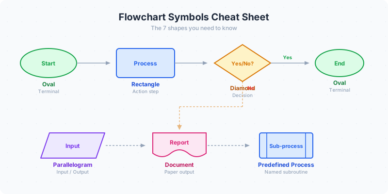
Flowchart Symbols Guide: Shapes, Meanings & Examples (2026)
Flowchart symbols defined with examples: oval start/end, rectangle process, diamond decision, parallelogram input/output, arrows, connectors, documents, and database shapes.
Read moreBuild a Full Infographic
Combine charts, timelines, stat cards, and 80+ widget types into a complete infographic.
Try the Full Editor