Free Radar & Spider Chart Maker
Charts & GraphsCompare multiple variables on a single chart. Build a radar chart, spider chart, or web chart online — skills, product profiles, athlete stats. Free, no signup, no watermark.
Free PNGNo signupNo watermark
Loading tool...
Was this tool helpful?
Watch the Tutorial
Set each axis and its scores, compare current against target with a second series, add a seventh axis and see the shape redraw, then toggle grid, labels, points, values and fill.
How to Use
- 1
Open the radar chart maker
Launch the free tool — works in any browser.
- 2
Add axes
Enter 3–8 dimensions to compare (Speed, Power, Range, Accuracy, etc.). Each becomes an axis radiating from the center.
- 3
Set values
Rate each axis from 0–100 (or any consistent scale). The polygon connecting your values shows the profile shape.
- 4
Style
Pick a fill color and opacity for the radar polygon. For comparing two entities, overlay a second polygon in a different color.
- 5
Download
Export as PNG — free with no watermark.
Why Choose GraphMake?
What Is a Radar Chart?
A radar chart — also called a spider chart, web chart, or star chart — displays multiple quantitative variables on axes that radiate out from a common center point. Each axis represents a different variable, and a single data entity is drawn as a polygon connecting its value on each axis. The shape of the polygon shows the profile of that entity at a glance.
Radar charts originated in the early 1900s as a way to visualize multivariate data in quality management. They became popular in the late 20th century for competitive benchmarking, employee performance reviews, and video game character stat displays. Today they show up anywhere people need to compare two or more things across several dimensions simultaneously.
The power of a radar chart is shape recognition. A team that's strong across every dimension produces a large, balanced polygon. A team with one weakness produces a polygon with a visible dent. A team with one outlier strength produces a polygon with a spike. The human eye picks up these shape differences faster than reading a table of numbers.
Radar Chart vs Spider Chart vs Web Chart — Same Thing, Three Names
Radar chart, spider chart, and web chart describe the same visualization. The different names come from visual metaphors. "Radar" evokes a radar screen with concentric range rings and axes pointing outward. "Spider" comes from the polygon resembling a spider sitting on its web. "Web chart" emphasizes the cobweb-like look of the axes and polygon together. Engineering and statistical writing tends to say "radar chart"; gaming and sports contexts often say "spider chart"; informal and educational writing sometimes says "web chart" or "star chart".
The visualization is identical regardless of name. Axes radiate from a center point, one per variable. Values are plotted at the appropriate distance along each axis. The plotted points are connected into a polygon. The shape of the polygon — triangular, star-like, balanced blob — becomes the visual signature of the entity being measured.
Our tool produces all of them from the same widget. Drop it in, name the axes, enter values, style the polygon. Whatever your audience calls it — radar, spider, web, star — the output looks the same.
When to Use Our Free Radar Chart Maker
Use a radar chart when you need to compare a few things across many dimensions. Skill assessments (rating an employee on 6-8 competencies), product comparisons (rating two phones on price, camera, battery, performance, and build quality), athletic profiles (comparing players across speed, power, agility, endurance), SWOT-style analyses — these are all natural fits.
Don't use a radar chart for ranking or for simple two-variable comparisons. If you just want to show that X is bigger than Y, a bar chart is clearer. And don't use a radar chart with more than 8 axes — beyond that, the polygon becomes so crowded that the shape loses meaning. Our how to make radar chart guide covers when a radar chart works and when it doesn't.
Our radar chart maker runs in the browser for free. No signup, no paywall, no watermark. Define your categories, enter your values, pick a color, export as PNG. Total time for a basic radar chart: under two minutes.
How to Structure a Good Radar Chart
Use the same scale on every axis. If you're rating things from 0 to 100, every axis should go 0 to 100. Mixing scales (one axis is 0-10, another is 0-100) destroys the visual comparison because the polygon shape becomes arbitrary instead of meaningful.
Order the axes thoughtfully. Put related dimensions next to each other so the polygon shape carries meaning. For example, if you're rating a phone, put "Screen Size" next to "Resolution" and "Battery Life" next to "Charging Speed" — related dimensions clustered together produce readable shapes.
Limit the number of axes to between 5 and 8. Three axes produces a triangle that doesn't really benefit from the radar format — use a grouped bar chart instead. More than 8 axes produces a polygon that's hard to read because the axes are too close together.
Why GraphMake Beats Other Radar Chart Tools
Most radar chart tools are either embedded inside larger suites (Tableau, Power BI, Excel) or buried in research-grade tools (R, Python matplotlib). The suites require licenses and have complex interfaces; the research tools require writing code. Neither is ideal if you just want to produce a clean radar chart image for a deck or blog post.
GraphMake's radar chart widget is designed for exactly that use case. Open the editor, add the radar widget, type in your axis labels and values, pick a color, export. The output is a clean, modern-looking PNG ready to drop into any document.
You can also combine the radar chart with other widgets on the same canvas. Put stat cards showing the overall score next to the radar chart. Add a text block explaining the axes. Include a second radar chart for comparison. Our editor supports 60+ widget types so the radar chart is one ingredient, not the whole meal.
Radar Chart Best Practices
Always label every axis clearly. Radar charts are read by scanning the axis labels and matching them to polygon vertices. If a label is missing or unclear, the chart stops working. Keep labels short (one or two words) so they fit around the edge without rotating awkwardly.
Use transparent fill for the polygon. If you fill the polygon solid, it hides the grid lines and the other polygon when you're comparing two datasets. A semi-transparent fill (around 30-40% opacity) lets the viewer see both the shape and the grid behind it.
Don't compare more than three datasets on one radar chart. Two datasets work great — you can clearly see which dimensions favor A and which favor B. Three is the upper limit. With four or more overlapping polygons, the chart becomes unreadable. If you need to compare many entities, use a grouped bar chart at bar chart maker instead.
Start the axes at zero if the minimum meaningful value is zero. Truncating the axes (e.g., showing only 40-100 instead of 0-100) can make small differences look dramatic. Our data visualization best practices post covers this truncation trap in detail.
Radar Chart vs Bar Chart vs Parallel Coordinates
A radar chart is best for comparing a small number of entities across many dimensions, where shape recognition matters. A grouped bar chart is better when you have many entities (5+) because the bars don't overlap and each entity stays readable.
A parallel coordinates plot is a more serious alternative for multivariate analysis. Each dimension becomes a vertical axis, and each entity is a line connecting its values across all axes. Parallel coordinates scale to more dimensions and more entities than radar charts, but they're harder for non-technical audiences to read. For business presentations, radar charts usually win on readability.
If you only have two or three dimensions, skip the radar chart entirely — a scatter plot at scatter plot maker or a grouped bar chart is clearer. The radar chart's strength is showing patterns across many dimensions at once; with few dimensions it's overkill.
Export and Share Your Radar Chart
When your radar chart is finished, click Export in the toolbar. PNG is the default and works for nearly every use case. For presentations or print materials where the chart will be displayed larger than the original canvas, use SVG so the lines stay sharp at any zoom.
The export is free with no watermark. If you plan to reuse the same radar format for multiple entities (comparing different job candidates, different products, different teams over time), export as JSON and re-import it — you only need to build the chart once.
For embedding in a web page, SVG is the best format — it scales perfectly and loads quickly. For a static slide deck, PNG is simpler. Either format is ready to publish.
What You Can Create
Skill Assessment
Rate competencies across leadership, communication, technical, creative, delivery axes.
Product Comparison
Compare two phones on price, camera, battery, performance, build — the radar polygons immediately show tradeoffs.
Player / Character Stats
Athlete stats (speed, strength, accuracy, stamina) or video game character attributes — the spider chart format is popular here for a reason.
Team Evaluation
Score teams on collaboration, innovation, delivery, quality — a radar chart profile per team makes strengths and gaps obvious.
Competitive Benchmarking
Overlay your company vs a competitor across feature categories to see where you win and where you lag.
Start from a Template
Jump-start your design with a ready-made layout — just replace the data.
Frequently Asked Questions
Is a spider chart the same as a radar chart?
Yes — "spider chart", "radar chart", and "web chart" are three names for the same visualization. The resemblance to a spider web gave it one nickname; the radial axes give it the other. Use whichever your audience is more familiar with.
What is a web chart?
Another synonym for radar chart. "Web chart" emphasizes the visual resemblance to a cobweb — straight lines radiating from center, connected by a polygon that looks like the outer silk. Same chart, different name.
How many axes should I use?
Five to eight is the sweet spot. Three axes produces a triangle that rarely benefits from the radar format (a bar chart reads better). More than ten makes the polygon crowded and hard to interpret.
Can I compare two or more entities?
Yes — overlay multiple polygons on the same chart. Two or three polygons compare cleanly; more than that and the overlaps become unreadable. Open the full /editor for multi-dataset radar charts.
When should I use a radar chart?
For multi-dimensional comparisons where shape recognition matters: skill assessments, product feature comparisons, player/character stats, competitive benchmarking, team performance reviews. Any scenario where you rate multiple things across the same set of criteria.
Related Tools
Free Spider Chart Maker
Make a spider chart (spider graph) online for free. Score anything on 3 to 10 axes, compare up to four profiles on one web, drag points to adjust scores, and download a PNG — no signup, no Excel.
Try it freeFree Chart Maker Online
Create bar, pie, line, donut, and other charts online for free. Data visualization without code — paste your data, customize colors and labels, then export a clean PNG instantly. No signup, no watermark.
Try it freeFree Polar Area Chart Maker
Create polar area charts (Nightingale rose / coxcomb charts) online for free. Each wedge has a fixed angle; its length shows the value. Perfect for surveys, skill ratings, and proportional comparisons.
Try it freeFree Comparison Infographic Maker
Create side-by-side comparison infographics for free. Compare products, services, ideas, or data with beautiful visual layouts. Export as PNG.
Try it freeFree Bar Chart & Bar Graph Maker
Create bar charts, bar graphs, and column charts online for free. Use horizontal or vertical bars, grouped or stacked layouts, custom colors, and PNG export - no signup, no watermark.
Try it freeLearn More

Chart Types Explained: Which Chart Should You Use for Your Data?
Bar vs. line vs. pie — every chart type has a job. Here's when each one works, when it doesn't, and how to pick the right format without overthinking it.
Read more
How to Present Data: Make Your Numbers Land
Data doesn't speak for itself. Here's how to present numbers clearly, pick the right format, and tell a story your audience actually follows.
Read more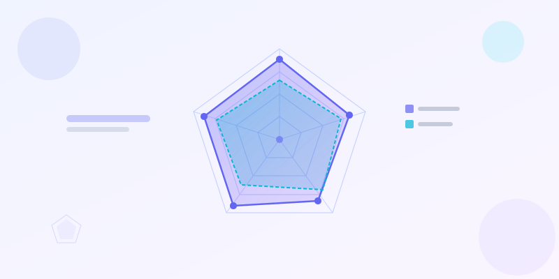
How to Make a Radar Chart Online — Free Spider Chart Maker
Create a free radar chart (spider chart) online. Compare multiple variables across categories with step-by-step examples, templates, and a free maker tool.
Read more